Colour begins with light and the colours we see are influenced by the characteristics of the light source. It is a saturation that our eyes collect; different saturations suggest different emotions or intentions.
Cool Tones
This screen grab is from the music video of the song 'Yellow' by Coldplay. The rhyme of the song is very slow and the lyrics are soft and steady. The colour setting appears very delicate and slow which obviously matches the song. The blue creates a cool setting that presents solitude, which matches with the singer on his own.
Warm Tones
This screen grab is from the music video of the song 'Tears Dry on Their Own' by Amy Winehouse. The rhyme is steady and upbeat in the song. The colour settings are warm and have a glowing golden tint, this presents the song accurately since it is a steady pace that can be perceived as calming, matching the warm glow, and the golden tint that keeps it happy and cheerful, similar to the song.
Colour & Emotion
Complementary

Complementary colours are colours that when combined, cancel each other out creating a grey. This means when the colours are put together in a piece of art they don't clash with each other in a harsh appearance and look more complementary with each other.


Analogous

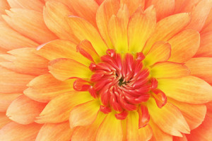
Analogous colours are groups of three colours that are next to each other on the colour wheel, sharing a common colour, with one being the dominant colour, which tends to be a primary colour.


Primary
Primary colours are three colours from which all other colours can be obtained by mixing. They are pure colours that have no other components other than themselves.

Secondary

Secondary colours are colours resulting from the mixing of two primary colours. Secondary subtractive colours are produced by mixing two other subtractive primary colours together.


Saturated

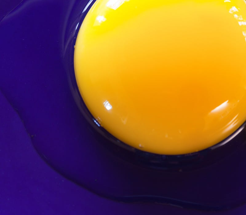
Colour saturation refers to the intensity of colour in a photo. The term hue refers to the colour of the photo itself, while saturation describes the intensity (purity) of that hue.


Muted

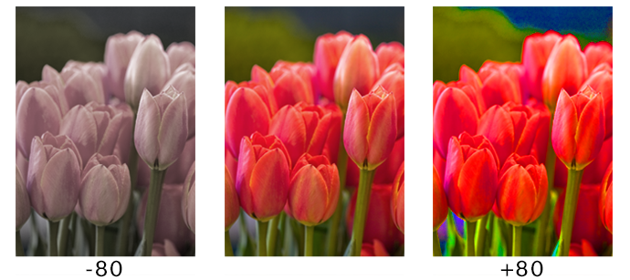
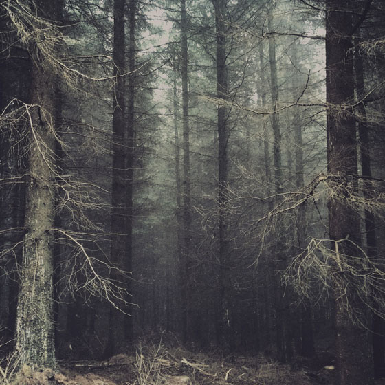
Muted colour means a colour or any hue but having low saturation. When you take a colour tone, and you mix it with white or grey, it dulls it down to make the colour lower in saturation or, in other words, it makes it muted.

.jpg)
Research
Robert Cartwright
Cartwright is a professional wedding and corporate event photographer based in London with a "passion" for street photography.
Cartwright's photos of London street lights present the vibrancy and glow of London in it's nightlife. The colours are typically warm toned (reds & oranges), creating a welcoming glow. The second photo is very sinister and owns an enticing colour combination; the purple and green is vibrant with a deep saturation that suggests something impure. The last photo owns muted hues but with some more saturated red tints; this makes the photo more welcoming and adds a sense of life.
Image Bank
Red

This photo creates a warm sensation when viewing it at first. The rose appears very powerful surrounded in a deep red, while still presenting a sense of sensuality. The warm glow creates a calming emotion even while with a slight dominance from the rose's shadow.
Orange

The photos setting creates a feeling of freedom, with the orange being very warm to the eyes and creating a softer appearance to the skin of the body. With this free feeling, it creates energy; making the photo more vibrant in emotion.
Yellow

This saturated hue creates immediate release and happiness. The muted blue in the background creates a stronger appearance to the yellow. The feet in the air create an insinuation of relaxation while the yellow glow to the viewer's eyes making them almost hypnotized.
Green

The deep green creates usually links to envy, but here it appears more sinister and mischievous. The simple 'Hello?' could suggest innocence since it is so simple, but the glow and dark setting makes it appear more impure, almost greedy. The vibrancy makes the photo more eye-catching and engaging.
Blue

The fact that no other colours are clashing with the blue makes the photo very concentrated; this makes it appear more intriguing. The shallow depth of field creates a feeling of isolation and coldness. The photo owns a clinical insinuation that can link with death and isolation once again from the cold glow.
Purple

Typically purple creates creativity and relaxation, but this photo creates more a sense of isolation and tension; this is because of the glow from the shops onto the wet concrete appears as lonely. The deep purple creates a depth of emotion but the emotion seems unclear.
Selected Photos
Contact Sheet
These are the raw photos that I captured on my DSLR camera. Some of the photos were captured using shutter-speed, these are light drawings, I was unable to capture these with colour but I plan to edit them so they are more vibrant and colourful.
Best Photos
These are my best-captured photos (untouched).
Photos that require improvement
These photos were selected for improvement due to lack of focus and exposure issues. For the first photo, the focus is out of place, leaving the detailing of the flowers undefined; I was using manual focus but due to taking these photos in the dark, the focus wasn't clear enough. The exposure was on F-stop 16 and ISO 11400, this didn't, fortunately, overexpose the photo but removed more depth to the flowers. If I were to retake this photo, I would use a tripod to keep steady for focusing and change the IOS so the detailing improves.
For the second photo, the focus was intended to be on the water droplets, causing the flowers to be blurry instead. The exposure was on F-stop 29 and ISO 12800, the exposure was clearly too high since the hue of the bulb isn't being collected as well as it should. If I were to retake this photo, I would change the aperture so it was shallow and focused on the water droplets instead, I would also lower the exposure so the depth would be stronger.
AO3: Record ideas, observations, and insights relevant to intentions reflecting critically on work and progress.
My Ideas
My idea for recording colour was to capture the neon lights and nightlife streets, examining typical colourful glow in the London streets.
My photo inspiration was based on the photographer Robert Cartwright, his nightlife of London photos captured the true typically dull but somewhat colourful London night culture, with his rainy window photo of the bus and wet pavement with light reflections on it.
My photos didn't turn out 100% to how I intended them to be since I couldn't go to the streets of London and capture similar photos, and the weather hadn't been typically British. So I had to improvise, which turned out better than expected. Nonetheless, I couldn't capture my original intentions, so if a next time occurs, I will be sure to capture the genuine colourful nightlife of London.
Reference to best photos
The first photo of the sunset was inspired by Cartwright. Since it hadn't actually rained, I used an acrylic slide sprayed with water to go in front of the camera lens to create a similar appearance to Cartwright's rainy window photo. The colours are warm and deep in that photo, creating a sense of comfort.
The third photo of the holographic can and purple hue of light was an idea in my head that turned out as intended. I used manual focus and lowered the exposure to..., to create a deeper hue and more defined reflection so it attracts more attention to the viewer.
The last photo ('bye'), is in an aqua blue hue light is vibrant and eye-catching. The blue is in high saturation and suggests isolation and solitude, the word insinuates this isolation more.
With regards to the photos of improvement, my original intentions were obviously not met so my composition was unclear at first, causing these photos to not turn out to the best of my ability. The shutter-speed photos were not originally colourful, so I had to edit them to create this appearance. Next time I will be sure to be certain of my composition and have the equipment for my photos to be the best I can be.
AO2: Explore and select appropriate resources, media, materials, techniques, and processes, reviewing and refining ideas as work develops.
Use of camera
I used a Nikon D3400 DSLR camera for every photo taken. Majority of the photos I used manual focus (first 13 photos), the shutter-speed photos I used autofocus since the focus didn't matter as much. For the other 11 photos, I used shutter-speed at different settings depending on the photos requirements.
Final Pieces
My inspiration photographer (Robert Cartwright) had vibrant and highly defined photos. So I put my photos onto Photoshop to edit them, for improvement on colour definition.
For the shutter-speed photos, I firstly pressed CTRL+U to open up 'Hue&Saturation', I clicked onto 'Colorize' so everything would turn into one hue, I'd choose a colour that fits best. Then pressed CTRL+L to open up levels to add depth to the surroundings of the light. For the other photos, I simply used 'Hue&Saturation' to make the photo more saturated, then opening levels again to create depth and more details for the photo.
AO1: Develop ideas through sustained and focused investigations informed by contextual and other sources, demonstrating analytical and critical understanding.
My artist research helped me to make my final decision with my colour photos, helping me realise that street (once again) and light photos really capture the photos that I find most intriguing. Colour is a perfect way to represent emotions and sensations within a photo; colour is such a broad topic and you can do some many things with it to create so many messages within artwork. Cartwright taught me how to present the London streets and cliche ways that it owns, which is something I find fascinating.
AO4: Present a personal and meaningful response that realises intentions and, where appropriate, makes connections between visual and other elements.
I believe my final pieces might have not matched entirely my original intentions or Robert Cartwright's work, but I still find my photos to present colour in a way that I personally enjoy when it comes to aesthetics. These are my final pieces.


good overall, but you will now need to record the camera settings as part of AO2 and use screen prints. The abstract use of colour is a great idea, I think you could consider pursuing this further in your forthcoming independant shoots.
ReplyDelete