Portraiture is used to present a representation or impression of someone. A portrait is a painting, photograph, sculpture, or other artistic representation of a person, in which the face and its expression are predominant. The intent is to display the likeness, personality, and even the mood of the person.
Portraiture can be used in simple forms, such as just presenting a person and their appearance, or in more complex forms, say to represent a message of identity or anything really if edited in a certain style.
These are a few of my favourite portrait photographers:

Billy Kidd
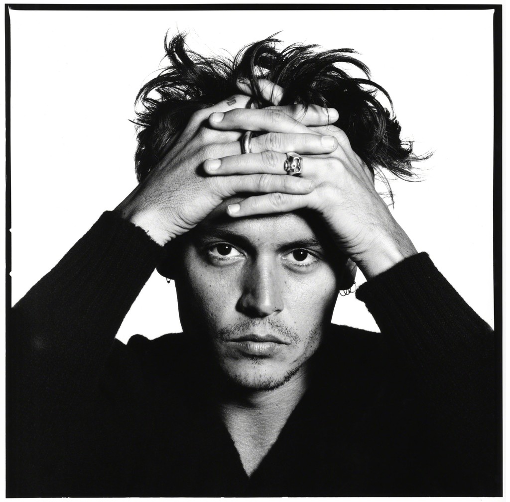
David Bailey

Diane Arbus

Edward Honaker
Research
This portrait of Winston Churchill was captured by the photographer Yousuf Karsh. To capture this essence on Churchill, Karsh was relatively impolite to Churchill to have him present a powerful mood. This photo was captured mid-war when the country needed to present their dominance and strength. Churchill appears very stern and dominant in this photo, his hand and body positioning conveys a comfort in himself, like a confidence within the current situation he was; this can appear intimidating to his enemies.
This portrait of Amanda Lepore was captured by the photographer David Lachapelle. Within this photo, Lepore appears very soft and feminine, this is due to her head positioning and the fact she isn't making eye contact with the viewer; this also gives her a power though. The even lighting creates an angelic atmosphere also. Even though she appears gentle in appearance, her facial features are so strong, it empowers her as a person.
Thomas Ruff
Ruff is a German photographer well known for his intriguing deadpan portraiture.
Ruff's work presents a similar aesthetic to Passport photos. His work originated as black and white portraiture, he eventually switched to fully saturated photos and then began to add colourful backgrounds to add a more alternative contrast. Ruff's portraiture composition allows the viewer to create their own connotations since they only reveal denotations; the style is formal and creates a slightly unnerving appearance for some viewers since there are no casualties. The physical print of these photos creates an intimidating atmosphere since they are so large, making every detail prominent.
Image Bank


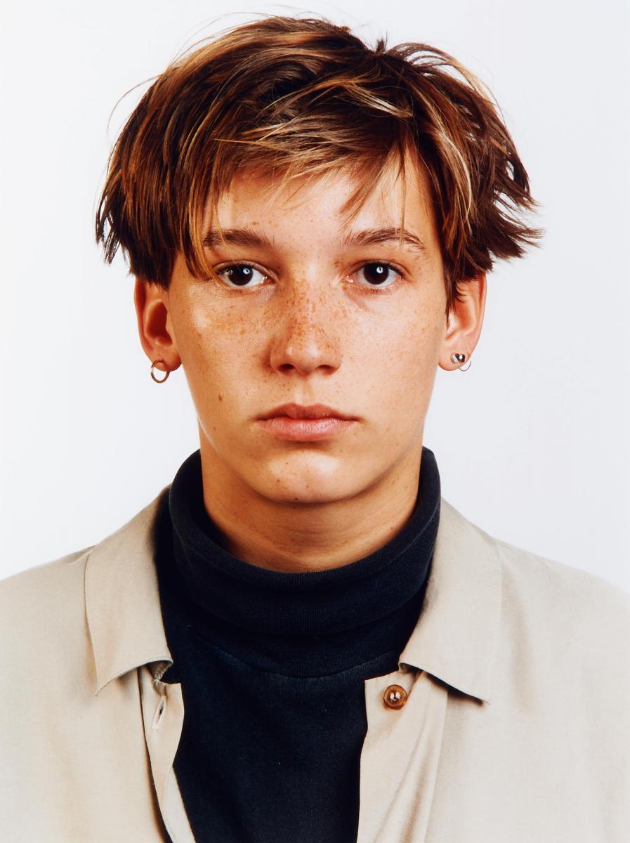

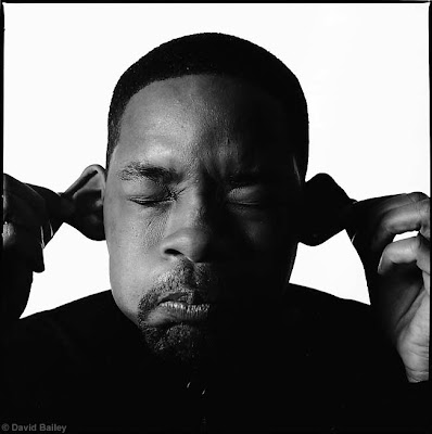 These photos represent the style of portraiture work I find admirable. Thomas Ruff and David Bailey have a different composition style, but they both own a powerful simplicity. Ruff allows the viewer to interpret his passport-like portraits themselves, with a formal and bland appearance; the saturation makes sure there's a small aspect of life still in the photo. Bailey brings more character into is portraits, having the subjects convey more personality and life, giving the viewer an easier time to make connotations; his work on the other hand, is black and white, but still present better life than Ruff's work. I plan to mainly recreate Bailey style photos with one subject, also having the photos black and white to test if I can still create lively portraits with zero saturation.
Contact Sheet
These are my raw photos for portraiture, captured on a DSLR Nikon camera.
Best Photos
These are my best-captured photos, untouched.
Photos that require improvement
I believe these photos do not present my portraiture the way I intended. For the first photo, the shutter speed is at 1/125, aperture F8, and exposure at ISO 200 since I was shooting in a mid-key photo setting. The main issue with this photo is the fact that the composition is unflattering to the subject; I was attempting to off guard capture in most of these portraits, this one seemed to be timed poorly, and the angle the camera is placed in an unflattering place. Furthermore, the backdrop is distracting, the subject was very tall causing unwanted background details; this removes some of the focus of the subject, which is not what I intended. If I were to retake this photo, I'd get at a higher angle, so the backdrop details aren't in the shot, I'd also time the photo better so the subject's expression appeared more natural and relaxed.
For the second photo, the shutter speed is at 1/125, aperture F8, and exposure at ISO 200 since I was shooting in a mid-key photo setting. The main issue with this photo is that it is out of focus; the camera was on autofocus but it appears that the camera decided to focus on something in the foreground. If I were to retake this photo, I'd make sure the camera was picking up the subject in full focus.
AO3: Record ideas, observations, and insights relevant to intentions reflecting critically on work and progress.
My Ideas
My intentions for portraiture was based on my favourite portrait photographers and their intriguing styles of capturing a subject. My main inspiration for this topic was David Bailey since his subjects always owned a lively atmosphere, and that's what I wanted with my photos since all my past portraiture has been bland in character. I believe my photos have come out as I intended; the exposure and shoot lightings were successful, I was able to capture the subject with an even exposure due to this. Majority of the photos were off guard captured, I did this because I wanted the photos to own a better authenticity in character.
Reference to my best photos
The first photo of a closeup of the subject I believe presents a similar style to David Bailey. Most of his work is up close and personal with the subject, but the expression on the subject's face creates a comfort for the viewer; I feel this photo does this.
The third photo of a worm eye level of the subject I feel presents more a Billy Kidd portraiture style. His work tends to involve more of the body and likes to present a stylish aesthetic with the subject's poses and demeanour; I feel this photo does this.
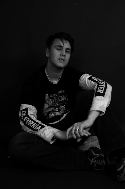
The last photo of the subject sat on the floor staring into the camera also I feel presents a Billy Kidd style. The stare and expression on the subject asserts confidence and a power over the viewer, while appearing more urban in positioning; this creates a stylish aesthetic, like Kidd's work.
AO2: Explore and select appropriate resources, media, materials, techniques, and processes, reviewing and refining ideas as work develops.
Use of Camera
I used a Nikon D300S DSLR camera for every photo taken. I decided to not use a tripod since I wanted to be able to move around and get a larger variety of angles when capturing the subject. The camera was set to manual mode, with the settings for the mid-key photos: Shutter speed, 1/125. Aperture at F8. Exposure was at ISO 200. For the low-key photos: Shutter speed, 1/125. Aperture at F4. Exposure was at ISO 200. I used a light meter to determine these settings in the different key settings.
Final Pieces
Since all my photographer inspirations produced monochrome portraits, I needed to do the same.
Firstly, I pressed CTRL+SHIFT+U to desaturate the whole photo.
Then using the 'Spot Healing Tool' to remove any blemishes on the skin of the subject to create a smoother and more gentle appearance.
Finally, I pressed CTRL+L to open up 'Levels' to then darken the shadow tones only slightly or it would appear too heavy in contrast, also slightly lowering the mid-tones for a better depth, and bringing the light tones up to create a stronger depth and contrast.
AO1: Develop ideas through sustained and focused investigations informed by contextual and other sources, demonstrating analytical and critical understanding.
My portraiture inspiration was based on a few of my favourite portrait photographers, all of which owned a distortion in typical portraiture standards, displaying an alternative style each. They taught me that portraiture can be very fluid in variety and even the most subtle of changes can create a completely different atmosphere. This topic has helped me to develop my concepts in portraiture.
AO4: Present a personal and meaningful response that realises intentions and, where appropriate, makes connections between visual and other elements.
I believe my final pieces meet my intentions for portraiture, the subject displays a comfort and authenticity within himself, making the photos appear less formal than typical portraiture. These are my final pieces for portraiture.
Image Bank


Contact Sheet
These are my raw photos for portraiture, captured on a DSLR Nikon camera.
Best Photos
These are my best-captured photos, untouched.
Photos that require improvement
I believe these photos do not present my portraiture the way I intended. For the first photo, the shutter speed is at 1/125, aperture F8, and exposure at ISO 200 since I was shooting in a mid-key photo setting. The main issue with this photo is the fact that the composition is unflattering to the subject; I was attempting to off guard capture in most of these portraits, this one seemed to be timed poorly, and the angle the camera is placed in an unflattering place. Furthermore, the backdrop is distracting, the subject was very tall causing unwanted background details; this removes some of the focus of the subject, which is not what I intended. If I were to retake this photo, I'd get at a higher angle, so the backdrop details aren't in the shot, I'd also time the photo better so the subject's expression appeared more natural and relaxed.
For the second photo, the shutter speed is at 1/125, aperture F8, and exposure at ISO 200 since I was shooting in a mid-key photo setting. The main issue with this photo is that it is out of focus; the camera was on autofocus but it appears that the camera decided to focus on something in the foreground. If I were to retake this photo, I'd make sure the camera was picking up the subject in full focus.
AO3: Record ideas, observations, and insights relevant to intentions reflecting critically on work and progress.
My Ideas
My intentions for portraiture was based on my favourite portrait photographers and their intriguing styles of capturing a subject. My main inspiration for this topic was David Bailey since his subjects always owned a lively atmosphere, and that's what I wanted with my photos since all my past portraiture has been bland in character. I believe my photos have come out as I intended; the exposure and shoot lightings were successful, I was able to capture the subject with an even exposure due to this. Majority of the photos were off guard captured, I did this because I wanted the photos to own a better authenticity in character.
Reference to my best photos
The first photo of a closeup of the subject I believe presents a similar style to David Bailey. Most of his work is up close and personal with the subject, but the expression on the subject's face creates a comfort for the viewer; I feel this photo does this.
The third photo of a worm eye level of the subject I feel presents more a Billy Kidd portraiture style. His work tends to involve more of the body and likes to present a stylish aesthetic with the subject's poses and demeanour; I feel this photo does this.
The last photo of the subject sat on the floor staring into the camera also I feel presents a Billy Kidd style. The stare and expression on the subject asserts confidence and a power over the viewer, while appearing more urban in positioning; this creates a stylish aesthetic, like Kidd's work.
AO2: Explore and select appropriate resources, media, materials, techniques, and processes, reviewing and refining ideas as work develops.
Use of Camera
I used a Nikon D300S DSLR camera for every photo taken. I decided to not use a tripod since I wanted to be able to move around and get a larger variety of angles when capturing the subject. The camera was set to manual mode, with the settings for the mid-key photos: Shutter speed, 1/125. Aperture at F8. Exposure was at ISO 200. For the low-key photos: Shutter speed, 1/125. Aperture at F4. Exposure was at ISO 200. I used a light meter to determine these settings in the different key settings.
Final Pieces
Since all my photographer inspirations produced monochrome portraits, I needed to do the same.
Firstly, I pressed CTRL+SHIFT+U to desaturate the whole photo.
Then using the 'Spot Healing Tool' to remove any blemishes on the skin of the subject to create a smoother and more gentle appearance.
Finally, I pressed CTRL+L to open up 'Levels' to then darken the shadow tones only slightly or it would appear too heavy in contrast, also slightly lowering the mid-tones for a better depth, and bringing the light tones up to create a stronger depth and contrast.
AO1: Develop ideas through sustained and focused investigations informed by contextual and other sources, demonstrating analytical and critical understanding.
My portraiture inspiration was based on a few of my favourite portrait photographers, all of which owned a distortion in typical portraiture standards, displaying an alternative style each. They taught me that portraiture can be very fluid in variety and even the most subtle of changes can create a completely different atmosphere. This topic has helped me to develop my concepts in portraiture.
AO4: Present a personal and meaningful response that realises intentions and, where appropriate, makes connections between visual and other elements.
I believe my final pieces meet my intentions for portraiture, the subject displays a comfort and authenticity within himself, making the photos appear less formal than typical portraiture. These are my final pieces for portraiture.


