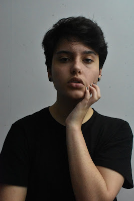
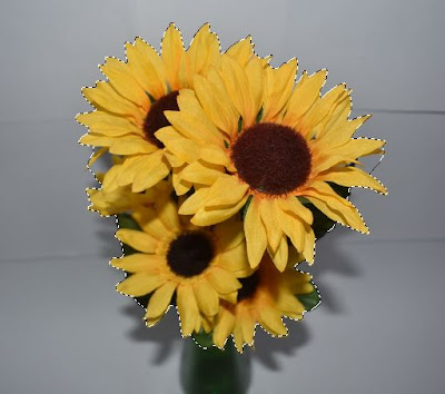
This independent shoot will be a combination of the formal elements tone and form. I plan to incorporate actual physical objects into these photos since I've tested portraiture with nothing added in, and portraiture with complex edits.
Research
David Bailey
Bailey is a very well known British portrait photographer. His work changed the cliche of portraiture in Britain, with his alternative black and white contrasting and composition. He's captured many celebrities such as David Bowie, Will Smith, Jean Shrimpton, etc.
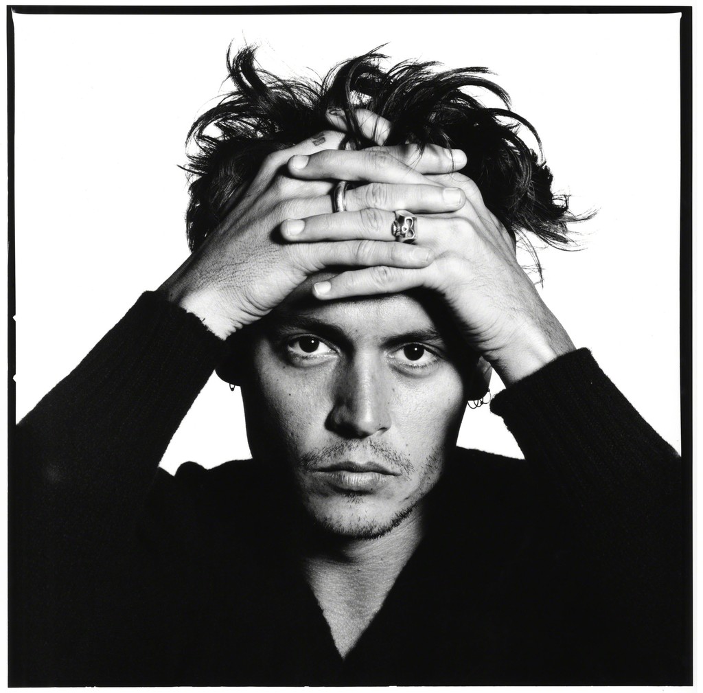 This portrait of the actor Johnny Depp is a good example of how Bailey's work owns a high contrast in his work. It's typical in male portraiture for the tone to be a lot darker since it subconsciously represents a more masculine appearance; this photo owns deep shadowing giving an example of darker tone working with male portraiture. The heavy shadows defining Depp's facial features, mainly cheekbones and jaw, creates a presentation of form since his dimensions are harshly defined. The composition directs all the viewers focus onto Depp and nothing more; the white backdrop and black shirt create a clash, so all the grey tones are the middle ground, which is where the focus will be put. Depp's hands through his hair and stare into the camera suggests a sensual atmosphere, this typically entices a viewers attention more.
David Bailey
Bailey is a very well known British portrait photographer. His work changed the cliche of portraiture in Britain, with his alternative black and white contrasting and composition. He's captured many celebrities such as David Bowie, Will Smith, Jean Shrimpton, etc.

Image Bank

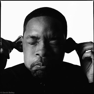
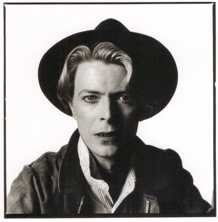

These photos from David Bailey represent the style of portraiture I enjoy the absolute most. The simplicity and high contrast in tone, while with slight suggestions of distortion is my favourite style for portraiture and I find very admirable. For this shoot I will be incorporating physical objects with to experiment with what I believe looks best for my portraiture, I plan to do a simple edit since a more complex one doesn't seem necessary for this shoot.
Contact Sheet
Best Photos
Photos that require improvement
I believe these photos do not present this shoot in the way I intended, the composition appears awkward and unprofessional. For both photos, the shutter speed was at 1/50, aperture on F8, and exposure at ISO 6400; the photos in these settings make the photos appear fairly dark, but that adds a more dramatic effect I feel and if any higher in exposure, the photos begin to become grainy in quality like in the last shoot. These photos were near to the end of the shoot and I was beginning to run out of ideas for how I could incorporate the book in a different way, so positioning the of my hands suggest uncertainty, same with my facial expression. The entire composition appears unplanned and awkward in appearance. If I were to retake these photos, I'd previously plan more certain poses and come up with better ways to incorporate the book with me so the photos appeared more professional.
AO3: Record ideas, observations, and insights relevant to intentions reflecting critically on work and progress.
My Ideas
My intentions for my third independent shoot was to experiment with physical objects since it was something I hadn't done yet. I wanted to incorporate books since I think they represent my personality and fascination best, and these shoots are meant to link with identity and the human form. I enjoy portraiture that involves more abstract concepts and finds that they can be intriguing easily, personally though I find simplistic portraiture more enjoyable and plays better into my strengths. I believe my photos technically met my intentions for this shoot, but I've realised that with this shoot that I excel better with simplistic photos and if I wanted, complex edits; I'm unsure of how to incorporate physical things well with a variety. It's not the most enjoyable either so I believe if I want to add in objects to my photos, I'm better off editing it in.
Reference to my best photos
The second photo of me with the 'One Of Us Is Lying' book while appearing as if I'm silencing the viewer I believe owns a strong linking with each other. Even if the viewer isn't aware of what the book is about, the title already makes the photo suggestive and when you add in my gesture, it creates a malicious atmosphere to the photo which I think is more enticing and dramatic.
The fourth photo of me with 'The Psychopath Test' covering the top half of my face, but slightly merging with the cover owns a slight humorous appearance, removing stereotypical portrait beauty standards. The book itself already creates a linking with identity, and to place it over my face creates a slightly dark effect since the connotations with psychopaths are negative and this photo suggests that I am one.
The fifth photo of me flicking through the 'F**k It' book I think presents an accurate representation of the book's title; my facial expression and posture appears careless and owns a slight attitude. My best photos are the ones that owned a strong link with me and the book because it sticks with a theme.
AO2: Explore and select appropriate resources, media, materials, techniques, and processes, reviewing and refining ideas as work develops.
Use of Camera
I used a Nikon D3400 DSLR camera and a tripod for every photo taken. Since these photos were taken of myself, I had to capture myself using self-timer while my camera was on a tripod, I used someone else to make sure all the camera settings, focus, and alignments were right. The camera was in manual mode, shutter speed being at 1/50 fraction of a second, aperture on F8, and exposure at ISO 6400 since the light setting was dark and struggling to capture me in any other setting. Once making sure everything was set right, I put the camera on self-timer (taking a photo every 5 seconds for 5 photos each time) and captured myself in various poses while with a book (4 books = 6 photos with each).
Final Pieces
Since my inspiration is based on tone and form, and the photographer David Bailey who is well known for his monochromatic portraiture, I need to edit my photos in the same style. I used the dodge and burn technique for this shoot since I believed it was best appropriate.
I firstly pressed CTRL+SHIFT+U to remove all saturation from the photo. Then pressing CTRL+L to open up 'Levels...' just so I could bring the mid-tones slightly up to reveal any smaller imperfections on my skin for the next step.
Then I used the 'Spot Healing Brush Tool', and removed any blemishes or open pores on my skin so I appear more soft to the face. I also have specs all over my wall/background and thought they seemed distracting, so I also removed those with the healing tool. If it was necessary, I would also use the 'Blur Tool' to smooth anything else out.
After this, I moved onto the dodge and burn technique. Firstly, I created an adjustment layer of 'Curves', this layer I dragged the mid-point down, making the photos mid-tones darker in appearance drastically, then pressing CTRL+I which inverts the layer. This should make the tab appear black instead of white. Secondly, I create another adjustment layer of 'Curves', this time dragging the mid-point up, making the photos mid-tones lighter in appearance drastically, then pressing CTRL+I once again to invert this layer.
After this, I used the 'Brush Tool' on a 'Soft Round' brush on a white colour since that is the opposite of the black adjustment layer, meaning it'll reveal the layers affect wherever I paint. Depending on where I was revealing either darker or lighter points, the opacity on the brush would depend on where. I'd highlight the points where I wanted more attention to or where the light was hitting, and darken areas that were too distracting or not necessary to be dominantly visible.
AO1: Develop ideas through sustained and focused investigations informed by contextual and other sources, demonstrating analytical and critical understanding.
David Bailey was my full inspiration with this shoot since his work owns a strong use of form and tone, and is always perfectly composed. He taught me that I shouldn't be so against stronger contrasts since if done well, it owns such a dramatic appearance. Overall, I believe I excel best with simplistic portraiture that just owns a distortion in stereotypical portraiture work, I know I could improve with incorporating physical objects but I personally don't enjoy the process of it all and it isn't necessary so I won't develop that most likely.
AO4: Present a personal and meaningful response that realises intentions and, where appropriate, makes connections between visual and other elements.
I believe my third independent shoot has been relatively successful with my experimenting with physical objects. Some photos own a strong link between the book and myself; I find these to be the strongest. This is my third independent shoot.


