This refers to the lightness or darkness of something. This could be a shade or how dark or light colour appears. Tones are created by the way light falls on a 3D object. The parts of the object on which the light is strongest are called highlights and the darker areas are called shadows. There with a range of tones in between the highlights and shadows. Without tone form does not exist, tone is, therefore, an important aspect in the visualisation of 3D objects. A camera will always assume that 50% of a photo owns grey tones, this is fine a regular photo, but this should sometimes be played with, this is where Ansel Adams comes in.
Ansel Adams developed the zone system a method of ensuring he achieved the correct exposure in his photos, this created the form of tone.
This off guarded photo of Marilyn Monroe presents the lighter zones in the chart. Zone 5, 6, 7 and 8 are the main tones that create Monroe's appearance; this makes her appear softer and her features are more delicate, this being a typical presentation of females in portraiture. The cliche in female portraiture is the light is proportioned evenly on the women features and they'll appear very soft, unlike male portraiture which is typically harsh when presenting features. This photo was captured when Monroe was off guard, this creates a stronger sense of humanity to the photo since models tend to play with facial expressions professionally, but Monroe here appears natural and more regular to any other person.
This photo of Damon Albarn presents the lower zones in the chart. Zone 0, 1, 2 and 3 are the main tones around Albarn's face; this makes his features appear more angular and harsh, adding a more masculine presentation. It's very typical in photos of men to be in the darker zone of tone, making their features more harsh and rough. The use of light hovering above him creates a less flattering appearance, the bags under his eyes are defined and his eyes are closed off by shadows; this can make viewers unsettled since eyes are a very personal and important component to portraits.Research
Ansel Adams
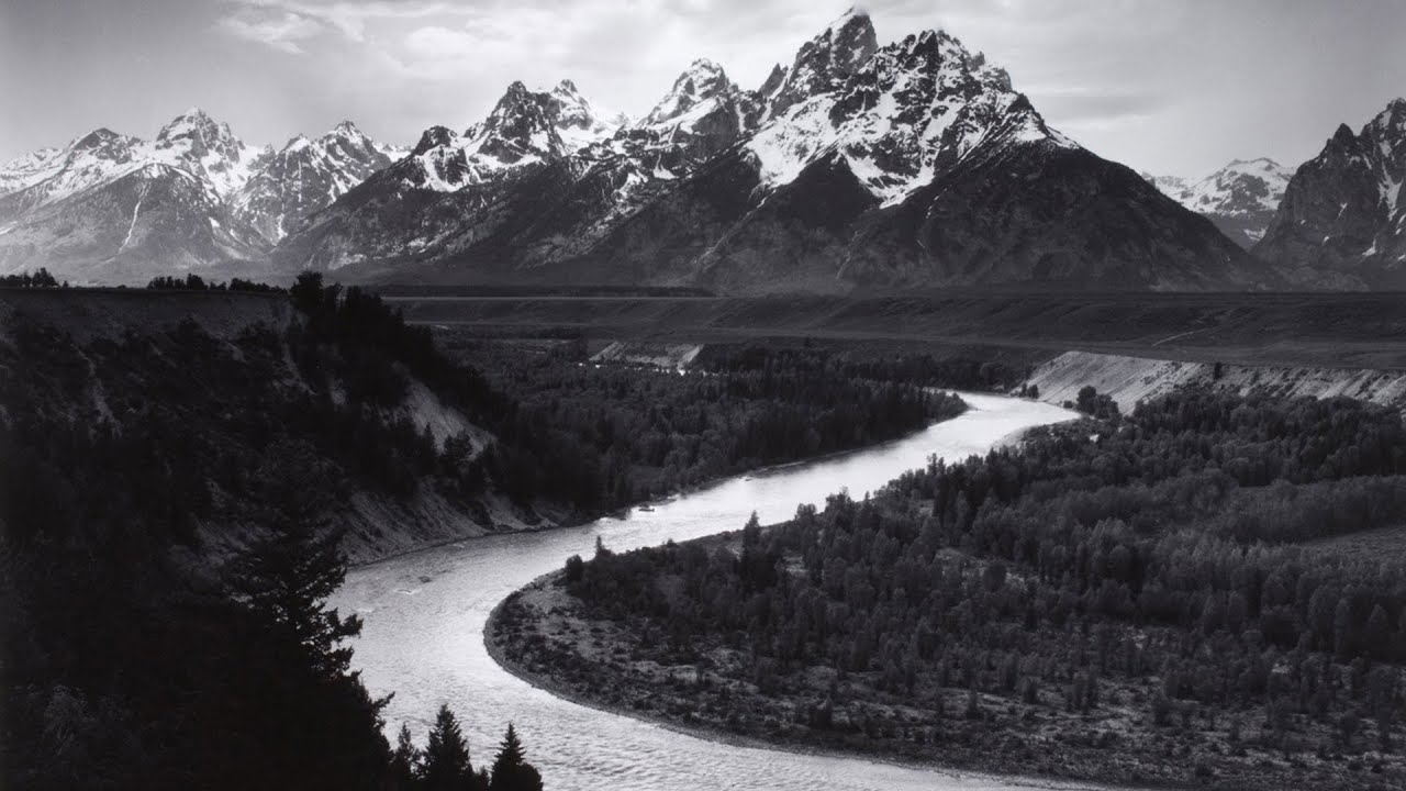
Adams is a well-renowned photographer for his creation of the zone system, used to have an even level of exposure on a photo and to understand what areas of a photo are labelled as zone-wise. Adams work is typically natural themed and portrays a monochrome presentation of mother-nature.


Image Bank


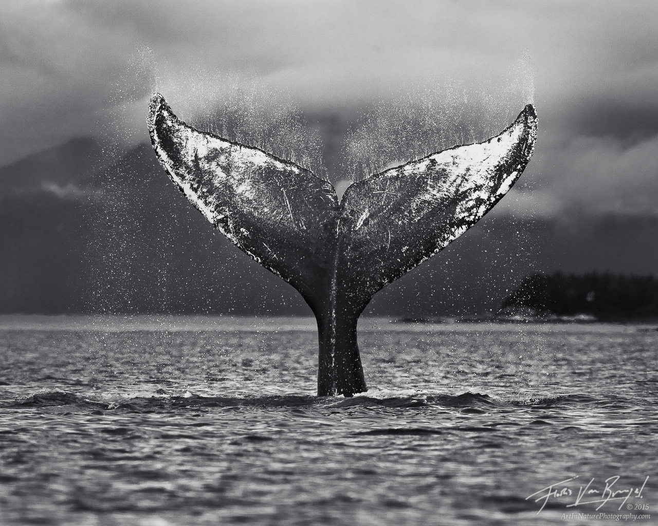
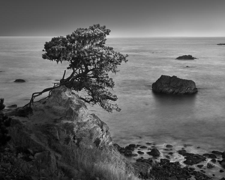
These photos represent the type of photos I personally think represent tone in an interesting way. Nature photography is my least favourite form of photography, but I do enjoy it still. I believe nature is a good form on presenting tone since it owns so much personality within it; nature is very abstract sometimes and can be intricate when this is played with light, tone becomes very important in a presentation. I plan for my tone portfolio to be nature-based, with a dramatic effect, similar to Adams's work.
Selected Photos
Contact Sheet
Contact Sheet
These are my raw photos for tone, captured on my DSLR camera.
Best Photos
These are my best-captured photos, untouched.
Photos that require improvement
I believe these photos do not represent my tone portfolio the way I intended. For both photos I find the level of tone to be very bland. The first photo, the shutter speed ISO was at 400 and its second fraction was 1/15. I was struggling to keep this photo exposure at a suitable level, it is at a reasonable level, but the photo doesn't present the tones 0 to 4 area; this removes some of the depth and dramatic effects I intended in my photos. If I were to retake this photo I'd change the ISO to 800 since the weather was very dull outside, and lower the fraction of a second maybe to 1/30, a tripod might've also helped with the level of focus.
My reasons for the second photo requiring improvement is pretty much the same as the first photo. The tone spread in the photo is very bland and blocky instead of smoothly spread. The shutter speed ISO was at 400 and its second fraction was 1/30. In this photo I was also struggling with the exposure since I was capturing areas of the sky, making it difficult to keep an even exposure. It does present all the tones on the zone system but not in an even manner so the photo becomes very bland in appearance. If I were to retake this photo I would try slowing down the shutter speed to maybe 1/8, to try and capture more light and keep all the leaves evenly visible still.
AO3: Record ideas, observations, and insights relevant to intentions reflecting critically on work and progress.
My Ideas
My ideas for recording tone was take full inspiration from Ansel Adams since he created the zone system and his photos own a dramatic but still peaceful appearance which I find admirable. Nature is a simple but beautiful for photography, if a photo is taken right, nature work can be genuinely hypnotising and that's what I wanted. I believe my photos in the broad intention came out as intended, but my struggle with exposure caused my photos to not appear as professional as I intended. They still own a dramatic appearance that I personally enjoy, but some of the quality is not up to par with my level of usual work.
Reference to my best photos
The first photo of the thin branch with a few yellow leaves wasn't particularly inspired by anything, I simply saw the branch and enjoyed the appearance of it from my perspective. I used shallow depth of field with aperture in this photo since it makes the focal point (the branch) more clear, and also makes the photo appear more professional; the ISO was at 400 since the lighting was relatively dull outside. The photo has an even spread of all the tones on the system and I think appears visually pleasing.
The third photo of the trees creating an opening of light at the top owned slight inspiration from the second photo in Ansel Adams's research section. I used shutter speed at the second fraction 1/8, which seemed to work perfectly to keep everything exposure wise even; the ISO also being at 800 which appears suitable for the photo. Like the first photo, the spread of tones from the zone system are even, and appear to ombre into the top centre; this creates strong depth into the photo and adds a more dramatic effect.
The last photo of the path framed by trees was just an idea in my head I decided to create. I used shutter speed at the second fraction 1/30; this did make the photo slightly grainy, but I believe this added to the dramatic, creepy effect that I wanted for my photos. This photo also owns an ombre effect to the centre of the photo; this creates a pleasing visual depth. The photo owns an even spread of all the tones in the zone system so I find the photo successful.
AO2: Explore and select appropriate resources, media, materials, techniques and processes, reviewing and refining ideas as work develops.
Use of Camera
I used a Nikon D3400 DSLR camera for every photo taken. All photos were captured in manual focus and the exposure was set at ISO 400 in shutter speed due to the photos being taken outside in dull weather. I didn't use a tripod and feel it might've helped my photos. No other techniques were used for capturing the photos.
Final Pieces
Since my inspiration was Ansel Adams, and the topic being tone, I'd need to remove all saturation in my photos and potentially bring out certain tones that were defined enough originally. So I placed my photos onto photoshop.
I firstly pressed CTRL+SHIFT+U to remove all saturation from the photo. Then pressing CTRL+L to open up 'Levels...' and dragging the dark tones lower to add more depth into the photos and make them sharper, this added depth to some of the darker tones and bringing the mid-tones up contrasted the more centred tones better.
Then pressing CTRL+M to open 'Curves...' dragging the centre of the line down only slightly to darken everything making details look more dramatic in the photos.
AO1: Develop ideas through sustained and focused investigations informed by contextual and other sources, demonstrating analytical and critical understanding.
My research on Ansel Adams's work helped me decide what would best fit my representation of tone, his work was tranquil bit still owned an unnerving aspect which is something I personally enjoy. Tone helps present form, which can be very important in some photography styles. I personally enjoy tone but I've realised nature photographer isn't my strong suit or something I personally enjoy much. I'm aware that live (model) photography would also suit this topic very well, and I personally enjoy this style more. So when it comes to improvement, I will be changing my photo style since I believe my presentation will be a lot more interesting due to me enjoying it more.
AO4: Present a personal and meaningful response that realises intentions and, where appropriate, makes connections between visual and other elements.
I believe my tone photos have matched my original intentions, by presenting nature in a gloomy way with high depth in the zone system. Although I personally didn't enjoy this form of photography and struggle a lot when it came to exposure techniques; I believe this is because I am unfamiliar with outside photography work, and wasn't used to the high demanding techniques needed to capture a quality photo, I plan to work on this for future work if needed. These are my final pieces.


No comments:
Post a Comment